01
The opportunity
The product was connected to a larger issue.
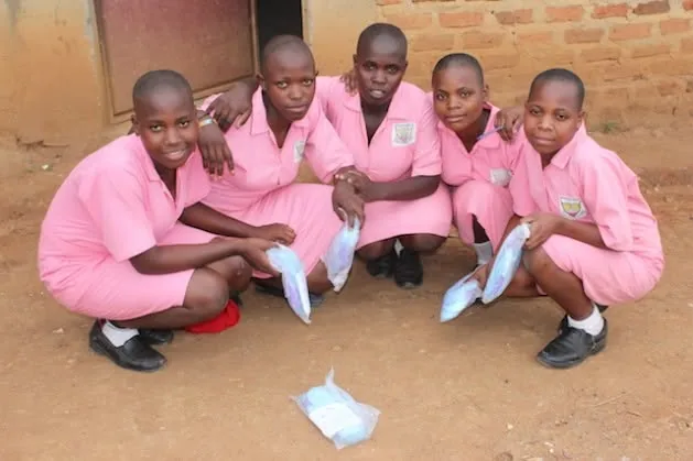
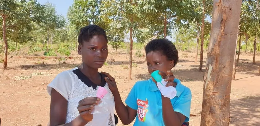
1Cup Foundation was conceptualized and branded as the social impact initiative connected to Chic Cup, a company selling menstrual cups.
Chic Cup was not only selling a product. It was connected to menstrual poverty, a larger issue affecting education, dignity, confidence, and daily participation.
The strategic challenge was to create an initiative that could carry that cause with clarity, compassion, and credibility.
02
The name
One cup could stand for more than one product.
The core thinking began with the name itself. 1Cup is simple, memorable, and direct.
It points to the product, but it also points beyond it. One cup can represent access, dignity, a girl staying in school, a woman feeling secure at work, or a community speaking more openly about menstrual health.
The brand idea was built around the power of one practical intervention to create a wider social effect.
03
The reality
Menstrual poverty is a participation issue.
Menstrual poverty is not only a hygiene issue. It is a participation issue.
When girls miss school because they do not have menstrual products, the problem becomes educational. When women cannot move confidently through work, church, markets, public life, or community spaces, the problem becomes economic and social.
When menstruation is surrounded by shame and silence, the problem becomes cultural.
04
The separation
Chic Cup could sell the product. 1Cup could advance the mission.
The strategic role of the foundation was to give the cause its own identity, separate from the commercial activity of Chic Cup while still connected to its purpose.
This distinction made the initiative more credible for partnerships, school programs, donor conversations, awareness campaigns, community education, and advocacy work.
It allowed the cause to stand on its own rather than feeling like a marketing extension.
05
The tone
Dignity, not pity.
The brand needed to feel human, hopeful, and practical. Menstrual poverty is serious, but the identity could not be heavy in a way that created distance.
The messaging direction focused on dignity rather than pity.
The goal was not to present girls and women as helpless. The goal was to show that access to menstrual care is a basic foundation for confidence, movement, education, and opportunity.
06
The movement
One simple thing can keep life moving.
The deeper cultural insight was this: a period should never decide how far a girl can go.
That insight gave the initiative its emotional center. 1Cup Foundation exists to challenge the quiet ways menstrual poverty limits lives.
It turns a simple product into a symbol of freedom, dignity, and continued participation.
The deeper belief
Because sometimes the most powerful change begins with one simple thing made available to someone who needed it.