CBTO Rebrand
Brand Story
CBTO Rebrand
CBTO came to OSC with a clear mission: to empower vulnerable communities through holistic care, focusing on health education, support, and personal growth.
However, despite their deep commitment to these values, their existing brand did not effectively communicate the hope and resilience that were at the core of their work. The challenge was to help CBTO create a strong, unified identity that resonated with both their internal community and external stakeholders, including donors, partners, and the wider public.
They needed a rebrand that reflected their transformation from a healthcare-focused organization to one that fostered broader community empowerment and growth.
At OSC, we approached CBTO’s rebrand with a deep understanding of their values: compassion, inclusivity, and empowerment. Our strategy was to encapsulate these values in a clear visual identity and engaging messaging that conveyed the strength and hope within the communities CBTO serves.
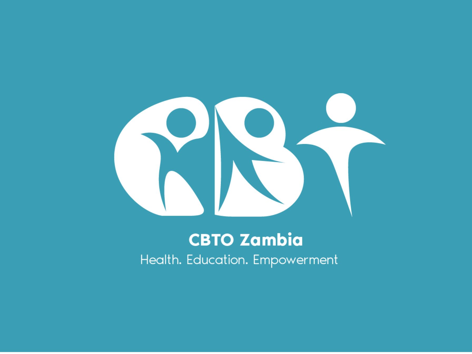
We crafted a new logo that embodied the idea of connectedness and community unity. The logo’s people-shaped figures symbolized the collective strength that CBTO builds through its work. We developed a color palette that reflected warmth, trust, and positivity—red for strength and resilience, yellow for hope and empowerment, and teal for community and trust. The use of black and white imagery for CBTO’s visuals emphasized authenticity and hope, portraying real moments of connection and empowerment within the community.


We then tailored CBTO’s messaging to ensure that it communicated their core belief: that true transformation comes not only through healthcare but also through education, mental well-being, and social support. This holistic approach was conveyed across all communication touchpoints, ensuring that each interaction reflected CBTO’s commitment to building healthier, stronger, and more resilient communities.
The Impact:
The rebranding efforts were a resounding success. CBTO’s new identity immediately strengthened its position as a trusted leader in community-based care. Their updated visual identity, paired with a clear, consistent message, helped CBTO attract more support from donors and partners, and engage their community in new and meaningful ways.
With a brand that authentically represented their mission and values, CBTO’s visibility and recognition grew, leading to increased enrollment in their programs and services. Their digital presence was revitalized, and they were able to communicate their message more effectively, helping to strengthen their relationships with the communities they serve.
Ultimately, the rebrand helped CBTO position itself as a symbol of hope and empowerment, allowing them to expand their reach and continue transforming lives with a lasting impact.
Recently in Portfolio


